
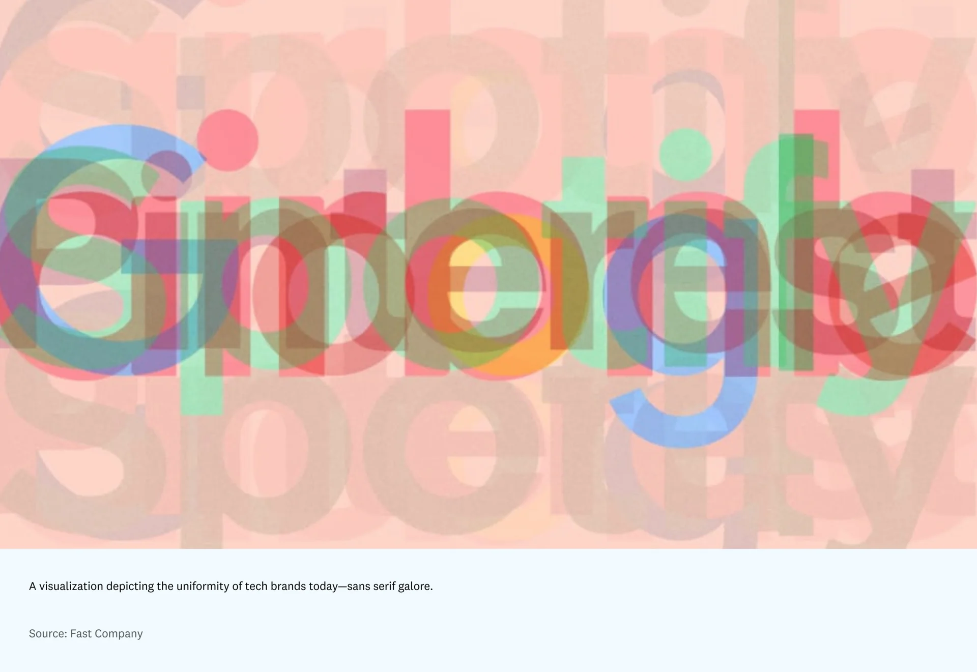
Over the last several years, tech companies’ digital design has begun to converge: a little eccentric, a little dull, and always safe. From sans-serif typefaces to soft pastel palettes, from bright white canvases to rounded button shapes and colors, most contemporary software now blends into a look so familiar you can barely tell one from another.
Traditionally, software’s appearance has reacted to the spirit of its era. For a long time, that was effective. That polished design language made products seem cool yet approachable, youthful yet dependable. More recently, though, that comfortably fashionable look has started to feel stale, as the many copycat websites make clear.
Software’s ordinary, identity-starved look has left users wanting tools with more character, tools that feel like us — or like a better, more interesting, stranger version of us.
As technology progresses, software will more and more be selected not only for how well it solves its job, but for how clearly it expresses personality, much as we choose our clothes. We are already starting to see that change. In highly individualized areas like note-taking apps and consumer crypto, software is often picked as a statement of identity. What I’d say we are seeing is the return of style in software: the way people recognize themselves in products and project that self-image onto them — transforming lifeless pixels into something with a soul. That change directly shapes the sort of users and community a product attracts.
Form over function
Since the earliest days of the modern computing business — IBM, Hewlett-Packard, and Bell Labs — software makers, who were also then the designers, have taken pride in caring more about how something operates than how it appears. Early computing and software relied on black, white, and beige tones — with beige supposedly picked because it helped mask wear. This rigid loyalty to function over appearance built a culture that celebrated turning away from aesthetics, at least until the 1970s. Impractical visual and emotional charm was seen as unnecessary, and computer bandwidth at the time could not support it anyway.
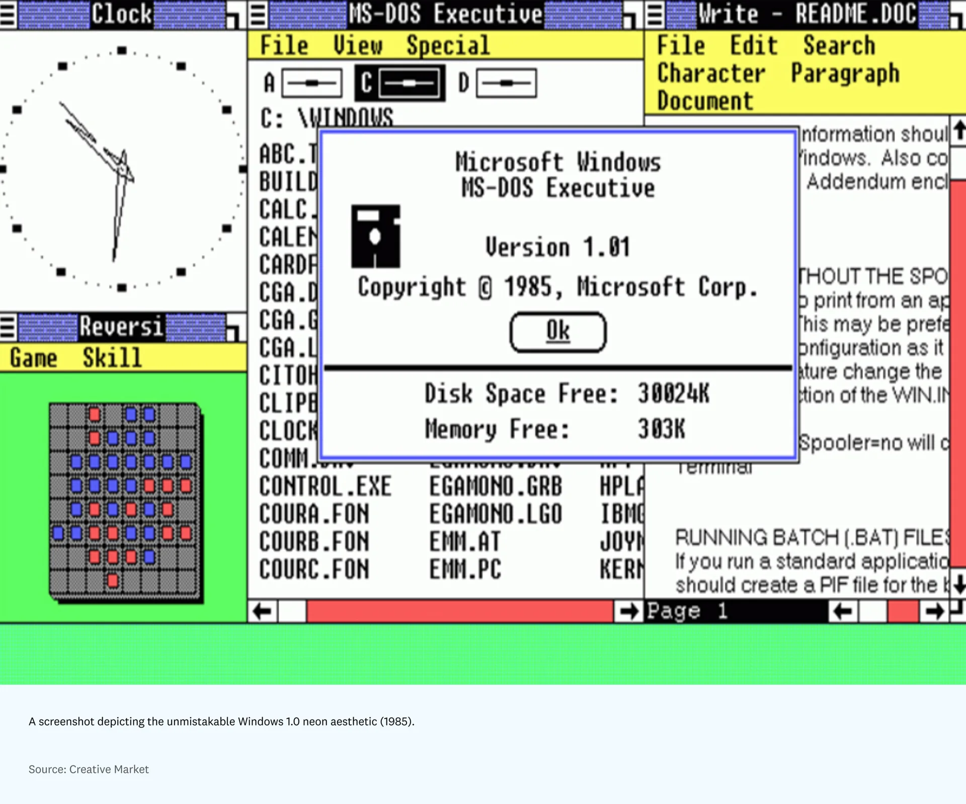
But as the field moved forward in the 1980s and 1990s, there was more room to experiment with aesthetic decisions beyond the bare minimum needed for function. As Nader Salha writes in Aesthetics & Art in the Early Development of Human-Computer Interfaces, “Strictly formal, mathematical reasoning had to be combined with informal, intuitive, aesthetic feeling. The gulf between the two cultures — the scientific and the literary — had to be bridged if the small computer on the desktop was to obtain wide acceptance.” You could see this turn in the Xerox Star’s distinctive portrait display and childlike GUI in the ’80s; the patterned, neon Windows OS of the early years (along with Clippy’s debut); whimsical early software such as Kid Pix; and the translucent, fruit-toned iMacs of the ’90s. Each of these products expressed a clear stylistic view of what computing ought to look and feel like, while also quietly suggesting who it was for.
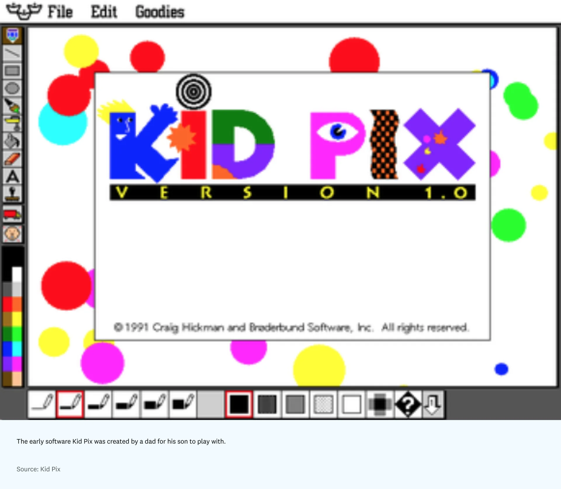
At that point, though, personal computing was still unusual enough that software was often built for a very particular kind of person or, in some cases, for just one person. Kid Pix, for instance, was made by a father who watched his son struggle with MacPaint and wanted a simpler, more playful tool to use. It did not have to win broad appeal, and computing was not yet widely available for that goal.
Jump ahead to now and tools are pushed to widen their market by trying to solve everything at once. But that also means the market for any one piece of software is often everyone and anyone.
Broad appeal, limited connection
Alongside the spread of software in the 2010s came the rise of a design language now called skeuomorphism. Major tech companies such as Microsoft and Apple embraced a visual style that stressed familiar realism and a glossy finish, as seen in Windows Vista and iOS 6. These looks were both appealing and instantly legible to newcomers because they used visual metaphors — like trash cans and file folders — that people already knew.
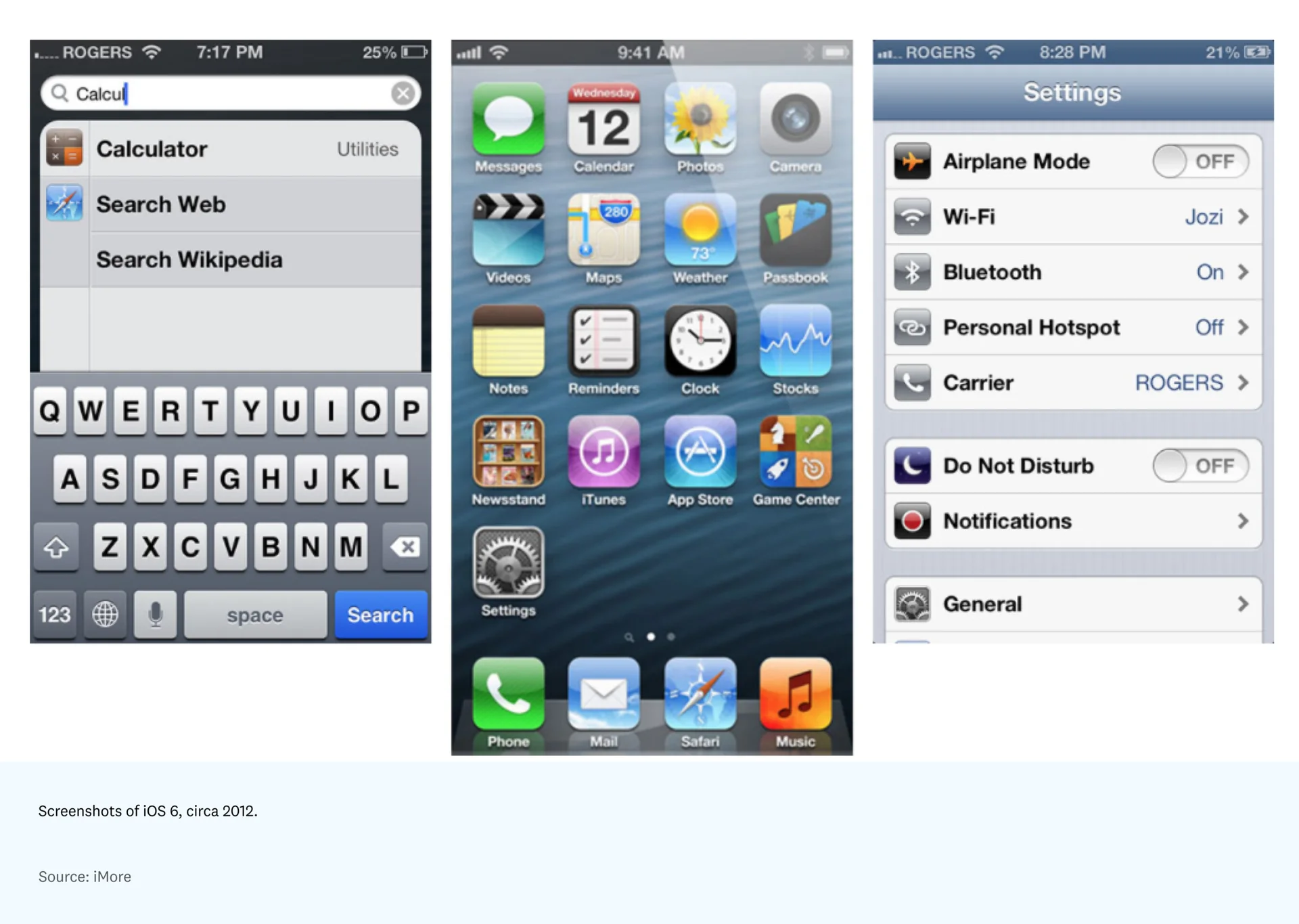
By making everything on the screen as lifelike as possible, the software effectively avoided having to declare its own style or position — it simply mirrored the outside world.
But as cultural tastes moved toward flatter, simpler styles, tech companies followed with a wave of branding that did the same — much of it feeling basically identical. This common minimal look borrows heavily from Apple-style smooth curves, Swiss graphic design, mistaken readings of Bauhaus, modern sans serifs, and pastel palettes to produce something that feels familiar and inviting to the intended audience: the modern millennial (and, more and more, Gen Z).
From Airbnb to Google to Spotify, this period has come to be marked by the commodification of approachable consumer brands — and now even enterprise ones.
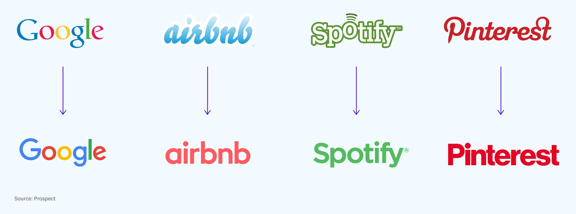
By trying to please everyone with these clean lines, gradients, and rounded forms, none of them feel especially compelling. And while these brands do serve their purpose in drawing the “right” audience to their software, they also make it hard to build a real bond with the user — the product comes across like a stylistic blank canvas.
A return to specificity
We have now come back around in the world of software and tech brand design. Software began as something specific — even made for one person — then broadened by trying to appeal to everyone and losing its identity along the way. In the aftermath of the tech industry’s uniform brand identity crisis, I believe we need to return to specificity if we want to reach users more widely.
But how do software and tool designers do that? What is style in software?
Style is not merely a striking color or a playful skeuomorphic icon. Style is the hard-to-describe quality that captures how a person feels when they interact with something. It is not simply adding splashes of color or animation to enterprise software to improve metrics. It is the feeling users have when every part of a product seems tailored to a particular personality they can recognize and connect with.
Style matters to our economy, our society, and to each of us individually — it helps us say who we are and who we want to become. While it is broadly accepted that style drives consumer buying decisions in categories like clothing, I would argue that the same is now true in technology and software too.
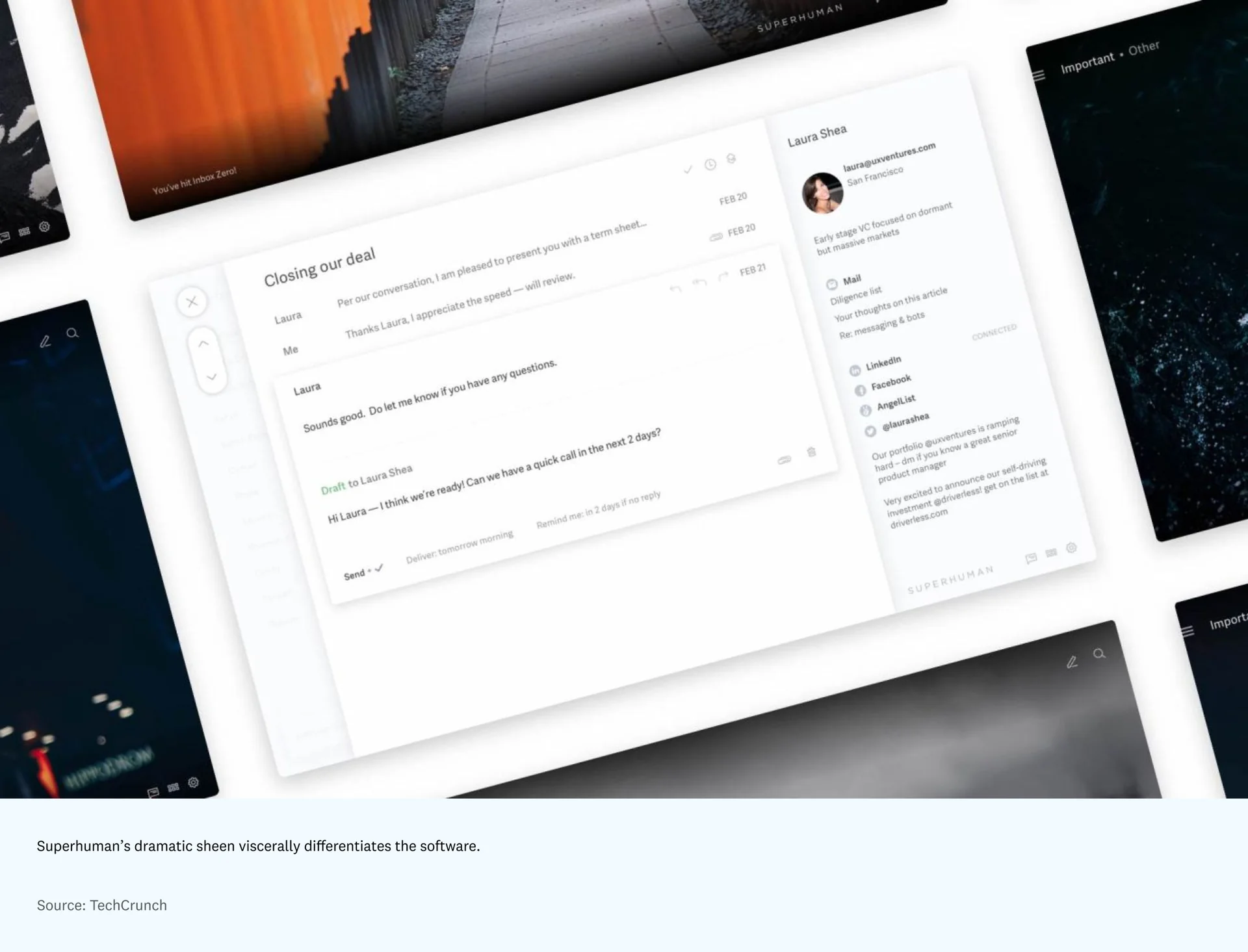
Consider one example: people will pay $30 a month for a refined email client, and even join a waitlist, partly because it feels specific and built from the ground up — every carefully chosen background, every message to the user, and every micro-animation is deliberate. It is that style that still spreads the word about the product organically among its aesthetically minded power users today.
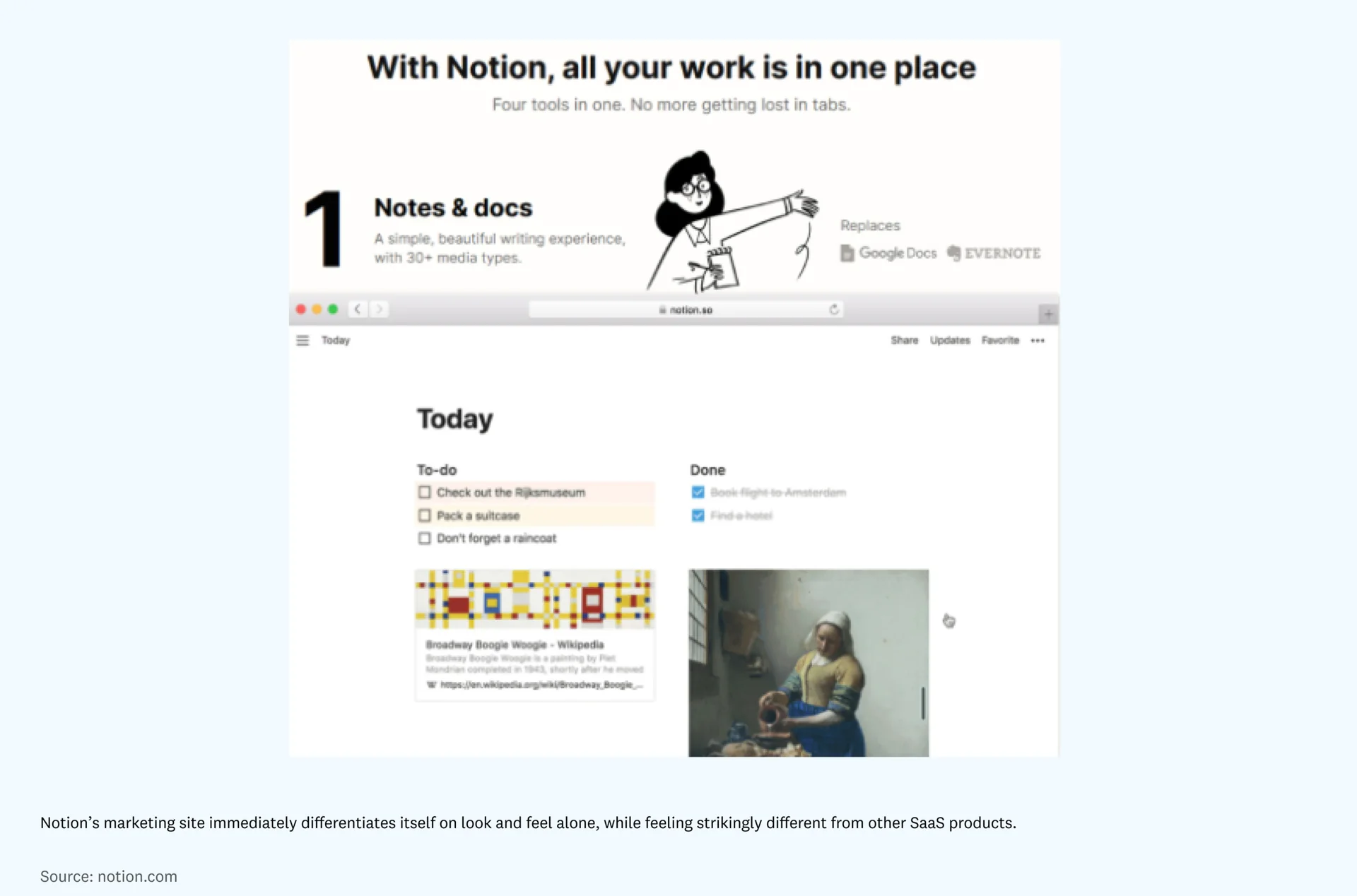
Style is not only about intention and appeal, though; it can also be what sets software companies like Notion apart from the start. The app’s calm setting, charming illustrations, and playful nods to technology history stand out in a crowded field of note-taking apps. Even though those details were not necessary from a functional point of view, they still help users connect with Notion and what it represents, which has in turn built the company’s devoted community.
Part of this, I think, is about restoring an opinionated approach to software design, where the tool makes a statement. For example, Linear’s sleek, glowing feel and clear stance on how work ought to be done show how an uncompromising commitment to a particular standard of pixel-perfect quality can be extremely compelling. In the same way, a product like Cash App shows how style inside a stagnant industry (in this case a financial tool) can feel memorable and intriguing — everything from the company’s illustrations to its tone of voice signals that this tool is trying (and, mostly, succeeding) to be perceived as cool by millennial and Gen Z users. The obvious link between Cash App’s style and its mission of “redefining the world’s relationship with money” is what makes it feel so magnetic to the people it is aimed at. That ethos shows up in everything from the brand’s apparel line to editorial-style storytelling pieces like “My First Bitcoin and the Legend of Satoshi Nakamoto,” a microsite that presents the features and benefits as a lead-in to using the product — all of which feels directly in step with their mission, and culturally progressive for the financial sector.
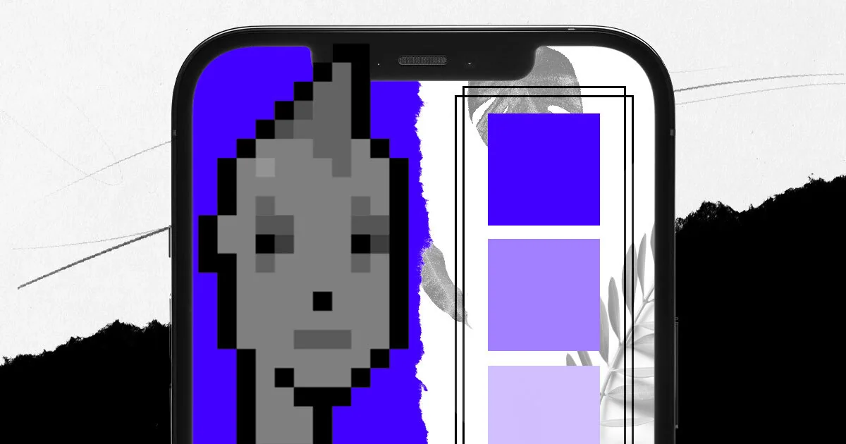
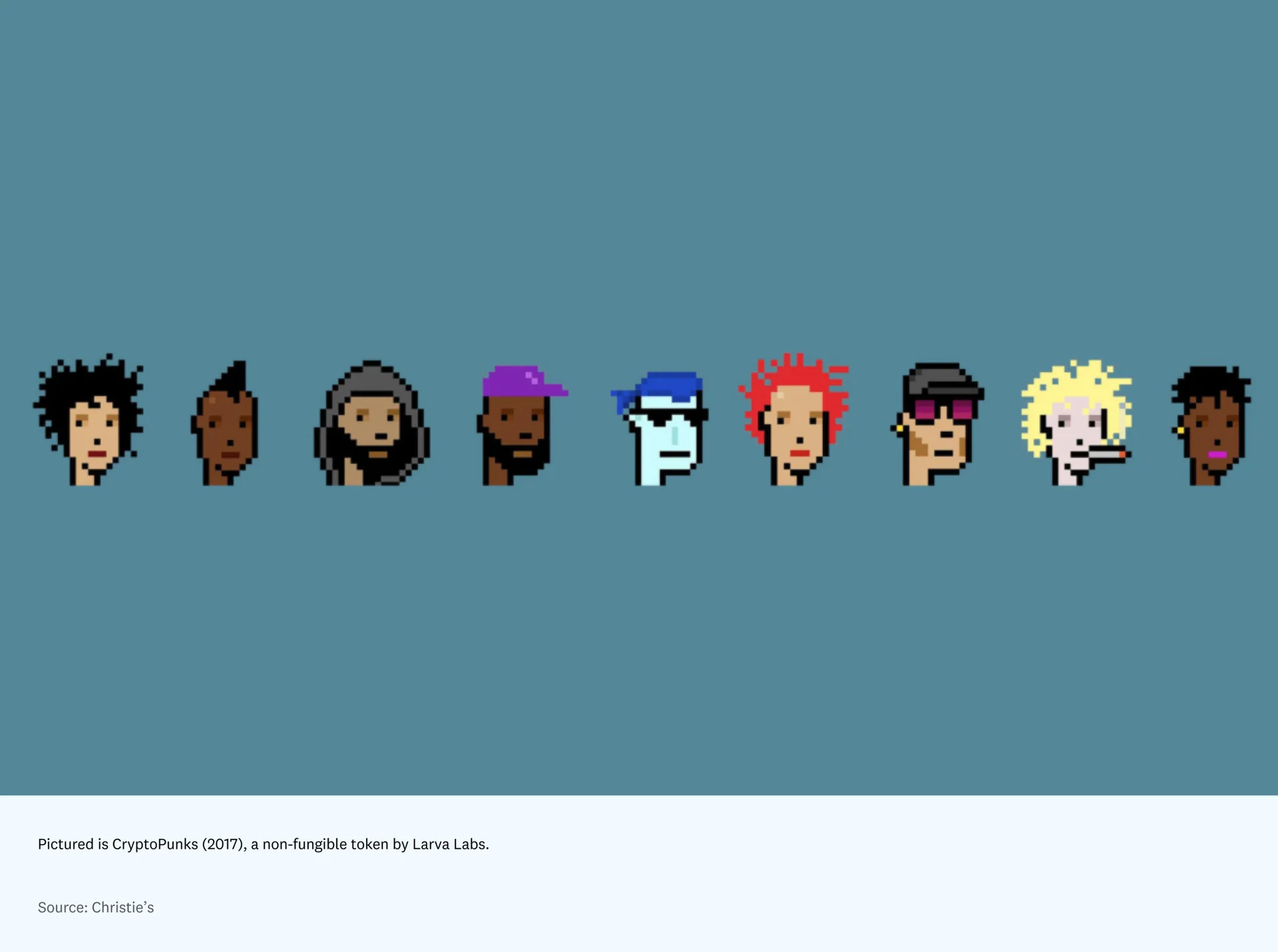
While the examples above speak to user appeal, there is also a deeper layer to consider here: community and identity. While crypto has historically favored function over form, the space has more recently become a leader in experimenting with style as a competitive edge. The crypto industry is now a clear example of how style, identity, and community can work together. But it also draws heavily from proven stylistic hype patterns from the art and fashion worlds — namely auctions and “drops” to build momentum and create scarcity or appeal to early adopters. Once you are part of the crypto community, everything from your choice of crypto wallet to which cryptopunk you might choose to buy is tied to identity.
Looking back as a guide for what comes next
Stepping away for a moment, a wider shared anxiety about online exhaustion — too many notifications, too many tools, and too many hours lost to scrolling and conferencing — has been voiced, especially during Covid. This feeling has encouraged nostalgia for the way we once engaged with technology, when it seemed fresh, enjoyable, and more like something we chose ourselves.
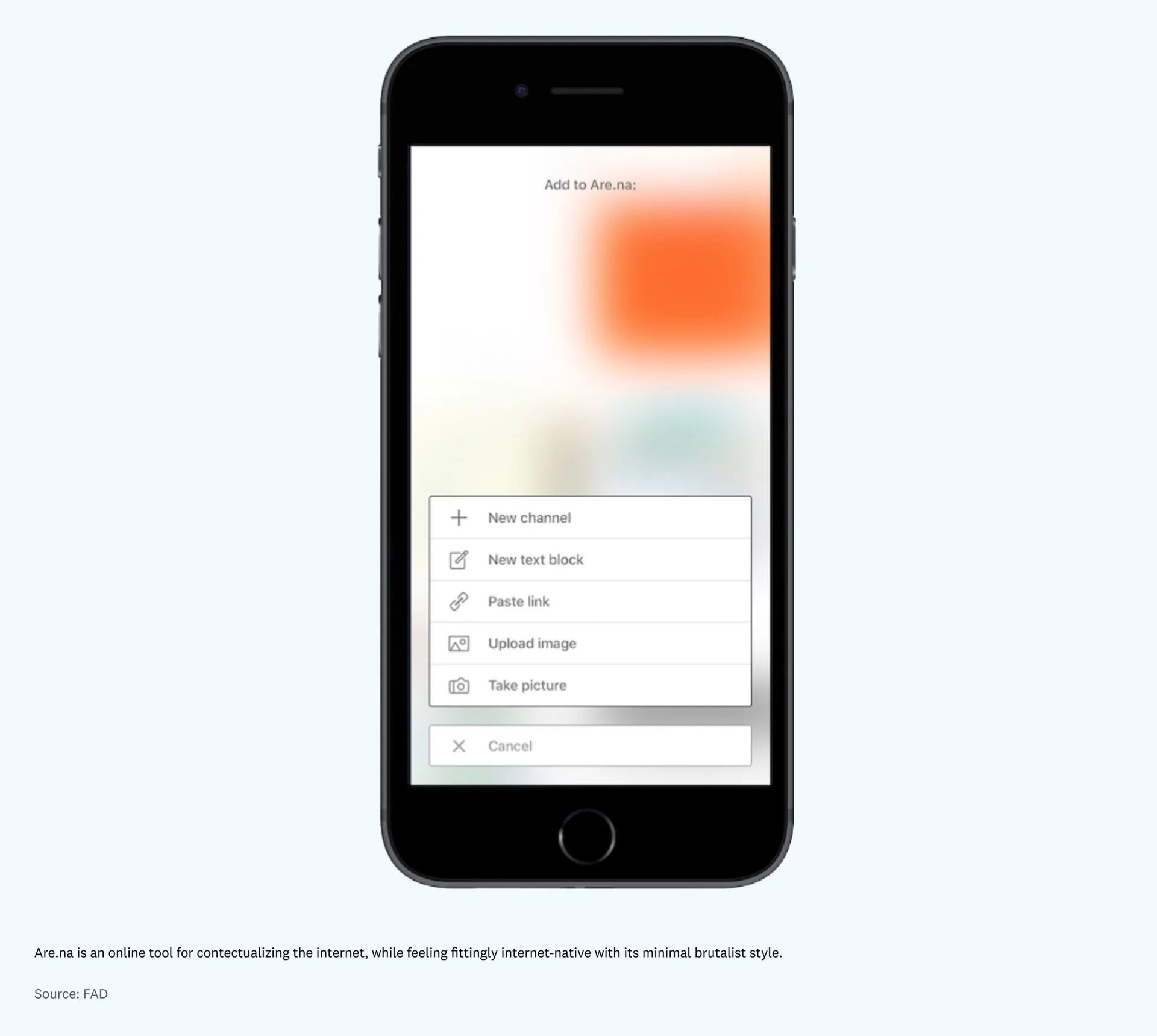
That nostalgia has appeared, in design terms, in everything from 8-bit and pixel art to Pokemon Go. It is a more backward-looking “return” to function over appearance — forms that are unapologetically shaped by the tool’s purpose for a smaller, more particular audience. For that reason, sites like Craigslist and Are.na resonate: Their analog internet look and chunky buttons feel bold and compelling in the present moment. Compared with the bland, blue-branded modern tools we all spend so much time using today — and that add to the same uniformity described earlier — these tools feel unmistakably full of character. You either connect with it or you do not, but it is almost preferable to be distinct in an old-fashioned way than identical in a new one.
Style can also make rebrand efforts from major tech companies seem as if those companies lack conviction or depth — the brand identities often appear to be a thin mask detached from how we read the company’s personality, and its actions, in the world. It seems that this weakening of stylistic authenticity happens often when huge companies try to bring their look into alignment across many sub-brands, with each one turning into a duller version of itself in the name of consistency.
I would argue that there is value in keeping the stylistic distinctiveness of sub-brands even beyond the point of practical need — people care more about visual consistency than they do about understanding a unibrand’s org structure unless it truly affects how they use the software. Although style is hard to scale because employees interpret it differently, it is not impossible. Large companies like Apple that have kept their stylistic dominance intact show this. It also highlights the importance of their detailed brand guidelines; the intention to hire only for a certain kind of style-aware person; and design (or as they call it, user experience) as one of the company’s core founding values.
* * *
Judging software by its style — and by how it makes us feel — marks a move toward seeing tech as part of our society and identity, rather than as a lifeless tool with no opinion. Software has become so woven into our lives that it is no longer merely a utility. In this new condition of the world, style conveys the software’s values and points to the kind of person it is meant for — something many tech brands today regularly fail to do.
In a world where “we shape our tools and thereafter our tools shape us” is now widely accepted, how will software companies that embrace the power of aesthetics reshape the fabric of our culture? And more importantly for designers and builders, how will we decide to shape our workplaces so they become places where teams with a shared stylistic vision can build software that feels more human?